Issue #14: Dime by Rafael Soh
Today, we're looking at Dime by Rafael Soh.
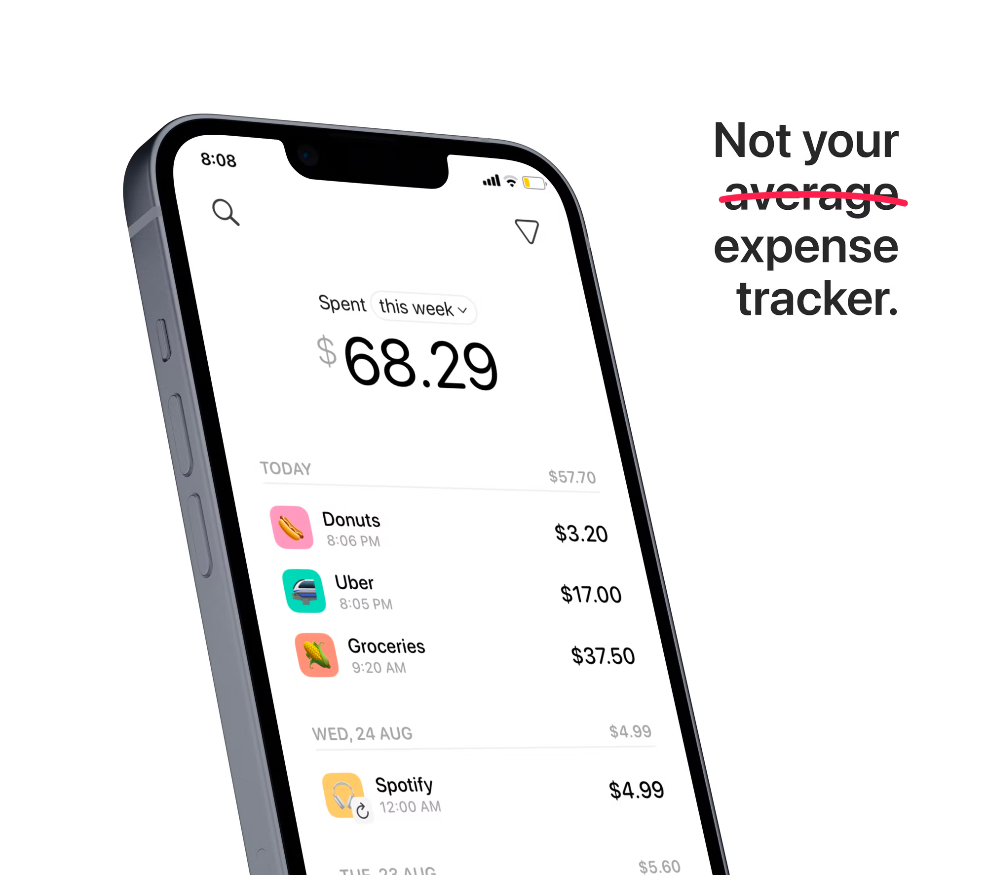
Dime is a beautiful expense tracker that makes it easy to monitor your expenditure and take ownership of your finances - not to mention that it's 100% free without any ads or paywalls 🙏.
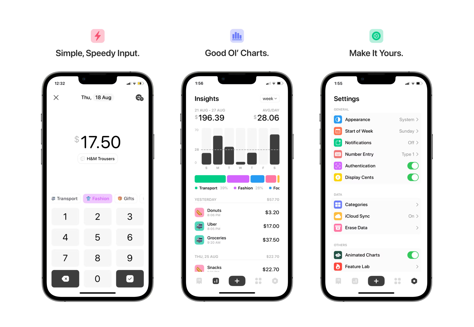
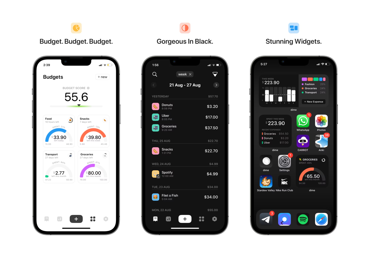
Notable Features
- Insightful expenditure breakdowns over various time periods.
- Create budgets based on expense categories.
- Easily create recurring daily, weekly, and monthly expenses.
- Sync your expenses, categories, and budgets with other devices via iCloud.
- Custom reminders to input your expenses.
- Biometric authentication to protect your data.
- Home screen quick actions make capturing new expenses a breeze.
If you like Dime, consider supporting and following Rafael on ProductHunt. It recently was the #4 Product of the Day!

A quick thank you to "The Daily Upside" for sponsoring this issue of Indie Watch!
The Daily Upside is a business newsletter that covers the most important stories in business in a style that's engaging, insightful, and fun. Started by a former investment banker, The Daily Upside delivers quality insights and surfaces unique stories you won't read elsewhere.
Can you tell us a little bit about yourself?

I'm an 18-year-old student that just graduated from junior college in Singapore. I’m a film photography fanatic (check out my work @camerafael on Instagram), and enjoy skateboarding and playing the drums too. I absolutely love Liverpool F.C.
I kickstarted my development journey at the start of the year and Dime is the first app I’ve built.
How did you come up with the idea?
I built Dime because I just was not satisfied with the existing options on the market. I found many of them to be too complicated and clunky, with too many unnecessary features - I didn’t really need to track my income or my assets for that matter.
Several of my peers shared similar sentiments, often complaining about the ugly UI of industry incumbents, and urged me to build my own. Moreover, I realized that many options that were marketed as being minimalistic lacked budgeting features, something I personally wanted in an expense tracker.
💡 Want to see your app featured?
Submit your app or reach out on Twitter 🐦
How did you market the app as an indie developer?
Marketing has been undoubtedly tough. As a relative newcomer to the Swift / iOS Developer community, I've found it difficult to spread the word about my app launch.
So, I turned to ProductHunt, which has been a pretty decent channel, yielding a couple of users. I hope to connect and get to know the community better and use that as an avenue to attract new users. I'm also planning on posting about my app on Apple-related subreddits.
What’s your app design and development workflow like?
Many of the screens of the app were first designed in Sketch, drawing inspiration from Dribbble mockups, before moving over to Xcode for the actual development. I built the data model first, before individually designing and developing each tab of the application.
And of course, as a first-time developer, I had to turn to constantly reference Stack Overflow and r/SwiftUI for guidance along the way. Hacking with Swift’s own forum also turned out to be a reliable repository of knowledge.
Any advice on monetizing your app and improving conversions?
Monetization has not been a major consideration for me.
Many users find it frustrating when their favorite apps and features are locked behind IAPs and subscriptions. So, charging for an application meant to help them spend more wisely seemed contradictory to me.
Closing Thoughts
Apologies for the lack of a release last week - I was on vacation in Scotland and I'm now back in the states ready to pick up where I left off.
In much the same vein as other indie apps we've seen, Dime was developed by Rafael to "scratch his own itch". Budgeting tools are usually geared more towards working adults, leaving the younger user-base behind.
While my budgeting needs extend beyond Dime's current feature set, I shared Dime with my little brother who's currently at university. Getting set up was easy and he mentioned that it made tracking his monthly expenses much easier.
More than anything, I'm blown away by how well-designed and feature-rich Rafael's first iOS app is! I know my first few iOS apps were nowhere close to including an iCloud integration, widgets, custom UI components, professional marketing screenshots, and a successful ProductHunt launch 🚀.
I've also followed Rafael on ProductHunt so I can easily keep track of any future projects - if his first iOS application is this robust, I can't wait to see what's in store next.
Follow Dime's Twitter account for updates.
A quick welcome to the ✨ 11 new people ✨ joining us this week - feel free to reply to this email and say 👋.
If you're enjoying the newsletter, please consider sharing it! Have some feedback you want to share? Drop me a message 📧
If you missed last week's issue, you can read it here:

If you're an iOS Developer with an upcoming interview, check out Ace the iOS Interview!
Subscribe or follow me on Twitter for updates!
