Issue #19: Happyfeed by Matt Kandler
Today, we're looking at Happyfeed by Matt Kandler.
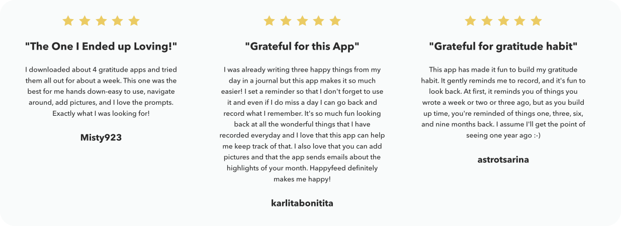
Happyfeed is a daily photo journal focused on mindfulness and gratitude. It hopes to change the way we view mental health — not as a personal struggle, but as a crucial part of daily life that benefits from social support and building healthy habits together.
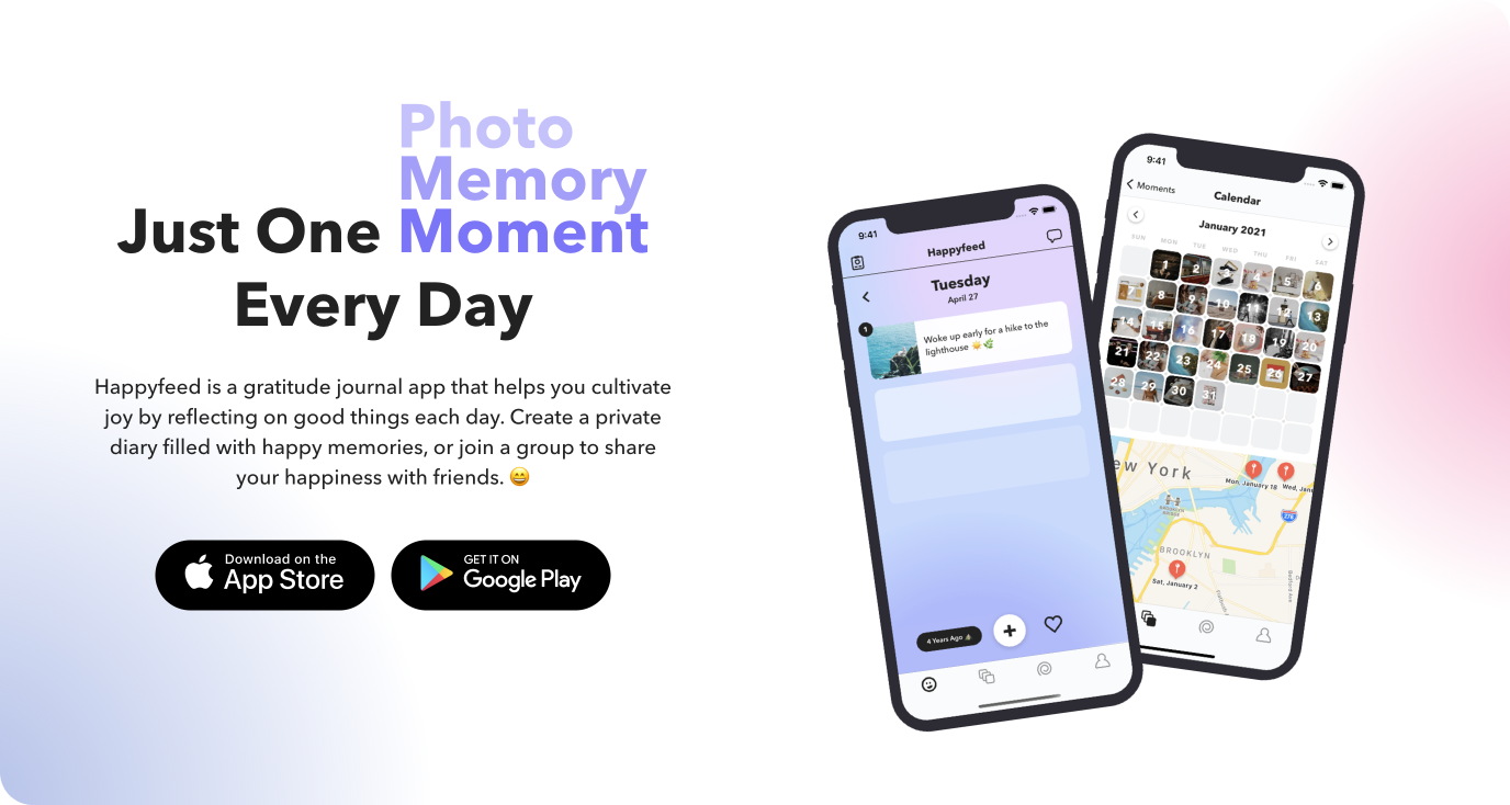
Gratitude journaling is a popular practice in positive psychology. At the end (or beginning) of each day, you record a list of three good things or gratitudes. By consistently reflecting on the good things in your life, you essentially train your brain to focus on the bright side.
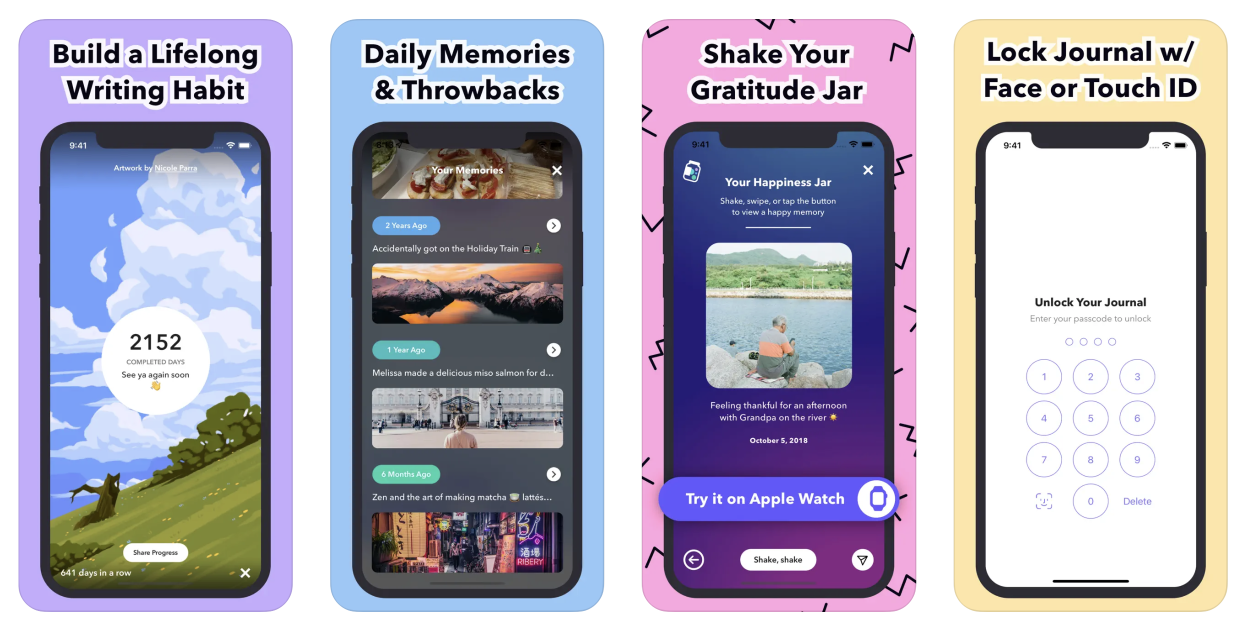
Gratitude journaling enables you to create a journal filled with exclusively positive moments. Research has shown that looking back on previous positive memories can often elicit more joyful feelings than the practice of recording those moments in the first place. Retrospection is a core focus of Happyfeed which is made easier by the "Happiness Jar" and "daily throwbacks" functionality.
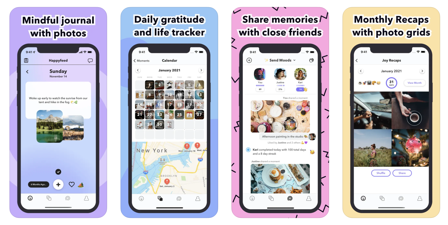
Every feature is designed to bring you more joy and Pods is no exception. Pods are private groups where you can share memories and send emoji reactions.
It's a novel way to send photos and share joy with your friends, partner, family, or even coworkers.

Each morning, The Sample sends you one article from a random blog or newsletter that matches up with your interests. When you get one you like, you can subscribe to the writer with just a click.
Can you tell us a little bit about yourselves?

I’m Matt, a 34–year-old software developer and UI designer based in New York City. I have a Master’s degree in Mechanical Engineering, but shortly after graduate school, I switched to software development. Coming from a focus on robotics, I gravitated toward the problem-solving nature of programming and the ability to iterate and create things quickly.
These days I split my time between freelance work launching websites (to “pay the bills”) and building my own indie app, Happyfeed.
How did you come up with the idea?
Happyfeed began as a tiny passion project.
After grad school, I co-founded a startup that was struggling to take off. The wind-down process was incredibly stressful and I went down an internet rabbit hole learning about positive psychology. At the time [2012], gratitude journaling was one of the few research-backed ways to boost your happiness. I started a Google Document called “Gratitude” and recorded 3 lines each day.
After we officially closed the startup, I was worried that I didn’t have enough skills to join a new startup as a designer. Mobile was still taking off (this was the early days of Instagram), so I decided to design and build my own iOS app. Turning my gratitude journal into an app felt like the obvious idea.
What started out as a learning opportunity turned into an 8-year habit for me. I've completed over 2,450 days in Happyfeed and almost 1,000 in a row!
💡 Want to see your app featured?
Submit your app or reach out on Twitter 🐦
How did you market the app as an indie developer?
In a way, I’ve been lucky with timing. When I started, the mental health category barely existed and there were only a couple of other gratitude journaling apps in the App Store. For a while, it was easy to get new users from App Store search.
Happyfeed mostly grows through word of mouth and I’ve been trying to amplify that concept by creating shareable experiences in the app. For example, users can share their completed day count at the end of each day and text their moments to friends. In 2020, I added a private group feature called Pods. These groups allow users to send moments to each other and simple emoji reactions - like a positive, light version of Instagram or group messaging. Creating a group and inviting your friends is just another way to amplify word of mouth growth in the app.
Outside of the product, I mainly focus on ASO, SEO, and occasional PR. For ASO, I test out new keywords and screenshots in the App Store about once a month. I use Appfigures and App Radar to research keywords and to see how current ones are performing.
A growing percentage of downloads are coming from Google Search traffic as well. My SEO strategy mostly involves writing blog posts around topics that I think are either evergreen (anything gratitude related) or trending (toxic positivity, for example).
What’s your app design and development workflow like?
In my day job as a freelance developer, I’ve been lucky to work with teams at successful startups. They test every line of code, hold standup meetings, and debate the merits of REST vs GraphQL. When Happyfeed has a couple more developers, it’ll be worthwhile to add more processes, but as a team of one, I value speed and flexibility above all else.
Whenever I have a new idea, I want to get it to users as soon as possible. You can spend weeks wondering how people might use a feature, but it’s 100x more valuable to give them a basic, functional version to try.
Here’s what my process for new features usually looks like:
- Come up with the idea - Typically from an analytics insight, a conversation with a user, or just something I want from using the app myself.
- Mull over the idea - This step is oddly crucial. I’ll have an idea written down for weeks or months before actually designing and building it. Eventually, I’ll have an epiphany for an interesting way to implement the feature while out on a walk or run.
- Paper and pen - Likely on the same day as my “epiphany,” I’ll draw out sketches of the interface and UI in my notebook with annotations about database fields, edge cases, and animation ideas. Keeping this step low-fidelity is important.
- Design in Sketch - From there, I’ll spec out key components of the design in Sketch. Often, I’ll end up tweaking designs directly in code, but it’s helpful to see how the layout looks on an actual device.
- Create To-Dos in Apple Notes - There’s nothing like a simple checklist to outline a project. I tend to go a few levels deep and get as specific as possible. Rather than “Add video uploader” I would break it down into tiny chunks like “Add video upload button to editor screen” and “Add tracking event for video button clicks.” I find that getting super granular makes it easier to start coding.
- Build it - Unless it’s a complex feature, like when I recently added following, I try to build the feature in a day or two. Even for large features, there’s typically a way to break it into smaller releases. I’m probably a little too impatient to get things into the hands of users. To balance that out, I always add event tracking and sometimes A/B test if I suspect a feature could possibly harm metrics. Small bugs can always be addressed in a follow-up release.
Generally, I try to release a new version of Happyfeed weekly on iOS and every two weeks on Android. Most of these involve minor fixes, but I write a monthly update for users, so I try to have interesting new features to talk about in that blog post.
Any advice on monetizing your app and improving conversions?
Happyfeed is a mental health app at its core. There’s evidence that recording things that you’re grateful for each day can actually make you happier. As such, a lot of people who try out the app are struggling with a range of issues from mild depression to far more serious conditions.
I’ve always thought that a freemium subscription made the most sense: it makes the experience accessible to anyone, but adds on extra features for people who want to pay.
Some things that have helped grow my subscribers:
- Retention, retention, retention: I know that users who add their first moment with a photo are much more likely to stick around than a regular sign up. I make that process as simple as possible to give myself opportunities later on to try and monetize or offer upgrades.
- Trigger based prompts: Happyfeed will show a popup describing the freemium subscription [Plus] when you reach a limit in the free version. For example, when you try to add a second photo to a post.
- Don't make subscriptions too hard to find: For a long time, Plus subscriptions were hidden in the profile tab and rarely discovered unless users were prompted by a popup. A couple of years ago I added a “Try Plus” button to the main upload screen header and it immediately boosted subscriptions. Some people didn’t even realize they could subscribe before and I haven’t heard a single complaint.
What's the secret to getting so many app reviews?
It’s been a long process to get up to that amount, but I think I have at least a few tips and tricks that could be helpful for others.
First off, you have to ask for reviews! I would skip any kind of custom prompt and just use the native SKStoreReviewController setup for iOS and the Android equivalent. According to experts I follow, the amount of ratings you get is one of the most important factors for search rankings.
Next, make sure that you trigger the prompt at the right time. In Happyfeed that’s usually after completing your daily entries - a time when users are feeling particularly happy and accomplished. Happy users are more likely to give you 5 stars!
I tend to have better luck when asking users to rate the app after a couple days, but sooner could be better if you have a high churn rate or aren’t creating a daily habit. For example, a hotel booking app may want to ask for a rating during the first experience because users may not return again for weeks if the booking was successful.
The most important thing is making sure that you have a good system in place so that you can easily capture ratings and reviews whenever user growth spikes. On the rare occasion that a major publication writes about Happyfeed or someone with 100k followers mentions the app, I have a ton of ways to try and get the most out of it. This includes asking for reviews, sending traffic to happyfeed.co for SEO, and creating opportunities for users to invite friends.
What's your favorite tool in your development workflow?
Based on how often I look at it, Mixpanel is definitely my favorite tool. It’s an analytics tool with a simple SDK and dashboards to view daily events, retention, funnels, and more. I carefully track most actions in Happyfeed ranging from signing up to tapping share buttons. With all the data feeding into Mixpanel, I can run A/B tests, segment data (e.g. do users who upload a photo retain better?), and keep an eye on key funnels in the app.
Otherwise, I only use a few other tools - Xcode for development, GitHub for version control, Sketch for design, Notes for to-do lists, and Notion to keep track of my ideas.
A quick welcome to the ✨ 5 new people ✨ joining us this week - feel free to reply to this email and say 👋.
If you're enjoying the newsletter, please consider sharing it! Have some feedback you want to share? Drop me a message 📧
If you missed last week's issue, you can read it here:
If you're an iOS Developer with an upcoming interview, check out Ace the iOS Interview!
Subscribe or follow me on Twitter for updates!
