Issue #28: Tasks by Mustafa Yusuf
Today, we're looking at Tasks by Mustafa Yusuf.
Tasks is the task manager you've been waiting for to help you take your productivity to the next level. It allows you to track and organize your commitments in a way that suits your specific needs and your preferred workflow.
In addition to traditional "To Do" and "Done" states, Tasks also offers the ability to track tasks that are in progress, in testing, on hold, and more.
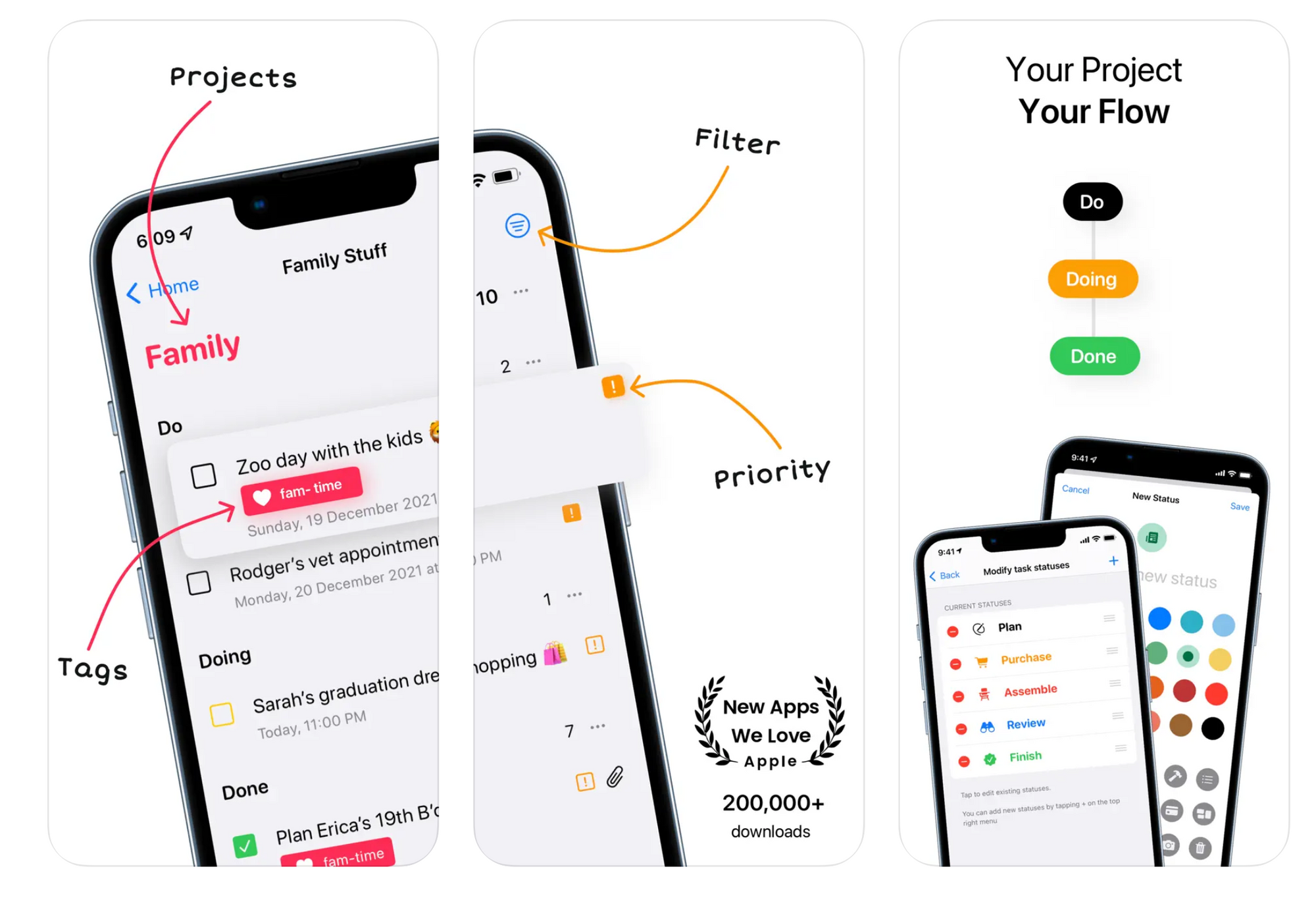
You can use tags to quickly see which tasks need to be completed, and you can also use folders, projects, tasks, and sub-tasks to hierarchically organize your life in a way that makes sense to you.
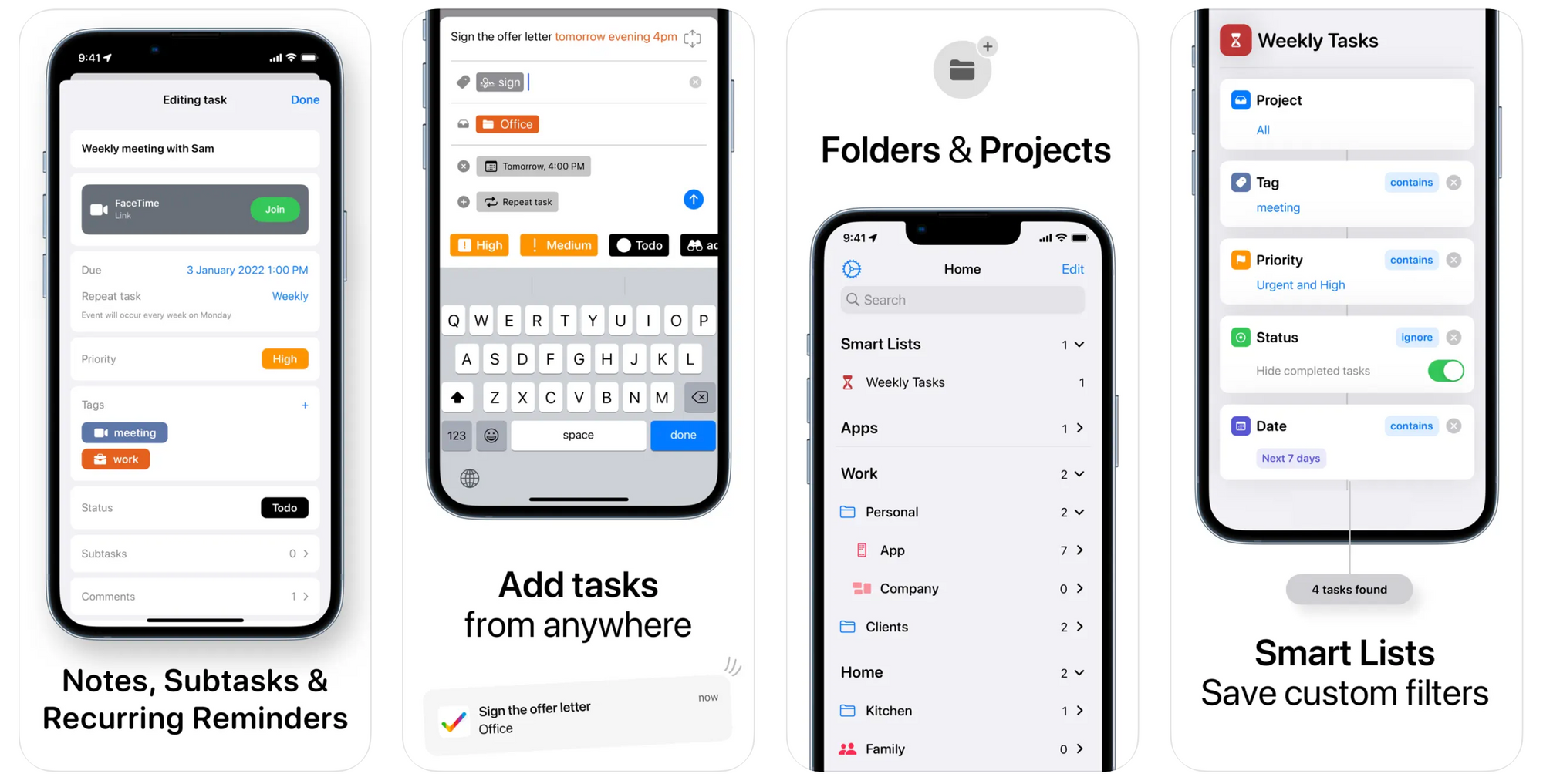
You can customize Tasks on a per-project basis, including adding notes, descriptions, remarks, and attachments like PDFs and images.
Other features include Home Screen widgets, Dark Mode, Siri Shortcuts, and support for keyboard and trackpad use on iPads.
It also offers iCloud sync support which allows you to access your tasks and their status across all of your Apple devices. Tasks takes privacy seriously, so all data remains in iCloud and is not shared with third parties.

Smartr Daily sources the smartest articles on the Web - thought provoking ideas and insights delivered straight to your inbox daily!
Can you tell us a little bit about yourselves?
Hi, I am Mustafa Yusuf. I am 26 years old and come from Mumbai, India. I'm an indie developer who works primarily on an app called Tasks. From the name you can guess what it does - it’s a task management app.
I’ve been working on Tasks for 2.5 years and now work full-time on it.
How did you come up with the idea?
I was building an app called Lingo. It's an English learning app I made for my wife to learn English, but, unfortunately, that app failed. So, in the process of building Lingo, I tried out multiple apps to help me organize myself and build the app more efficiently.
I just couldn’t work well with standard task managers which required tasks to be either categorized as “To Do” or “Done”. I really needed intermediate states - like “Building” and “Test” - before they could be marked as completed. Even the apps that worked had a few downsides, so I ended up using a pen and paper.
When Lingo launched, it didn't do well, so I moved on since it didn't require additional updates from my end. While I was thinking about what to do next, I recalled the pain I felt while trying to build Lingo.
I really liked JIRA at my then full time job. I liked it primarily because it was all setup for me and all I had to do was drag and drop tasks to various statuses. Fortunately, I didn't have to deal with the nasty setup process. It dawned on me, what if I created an app similar to existing kanban apps, but let it be simple, intuitive, native, and customizable all at the same time without being overwhelming?
That has been the core goal of Tasks.
Next, I began asking people about their favorite task managers, focusing primarily on two questions:
- What do you like the most about it?
- What does it lack?
Most people would say something along the lines of "I love XYZ but...". So, I focused on the "but" and consolidated a list of pain points and feature requests.
Some wished it allowed support for attachments, some wanted subtasks, some wanted tags, some wanted recurring reminders, and so on. So, I supported all of them along with all of the other essential features a task manager should include.
Now with all that feedback in hand, I sat down and started architecting my app's model / schema to make sure it could scale and support all of the requested features. I spent 2 months passively working on that, so by the time I started development, I already knew exactly how to build it.
I had no screens prior to developing it, I just started building it using all native/system-like components and planned to improve it later on.
I started development on March 8th, 2020 and by May 20th, 2020, I had it all completed and uploaded to the App Store. The first version of Tasks launched on the June 1st, 2020.
💡 Want to see your app featured?
Submit your app or reach out on Twitter 🐦
How did you market the app as an indie developer?
Sharing my journey on Twitter was something that was incredibly helpful in the success of Tasks. Posting teasers, showing off certain animations, uploading some screenshots of the app, etc. helped me get some followers and attention. I had barely a couple hundred followers back then.
Before launching, I prepared a press kit and sent it to various publications, but only a few actually wrote about it. I eventually had my app featured by the App Store Editorial Team a month after launch despite having filled out the form well before launch.
What’s your app design and development workflow like?
I think design is a rabbit-hole one should not go into initially. My advice is to focus on building the functionality and use the most basic design elements available.
Make it modular. That way when you need to tweak the design of a view, you change it once and it updates everywhere.
Once you build the functionality you will notice the app making progress and feel more encouraged to work on it. If you start with design, who knows when you’ll move past the onboarding screen only to later come back and revisit it and think it's outdated.
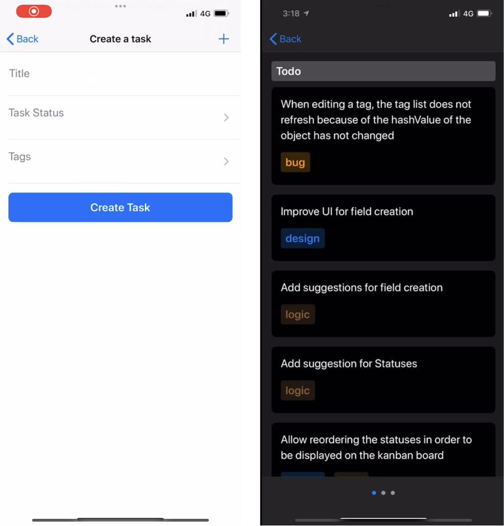
Tasks' first screen was a simple create task screen that I could use to start adding tasks, and the second was to view those tasks - it was functional!
Any advice on monetizing your app and improving conversions?
Don’t charge too low.
People will pay a lot more - be confident on your pricing. I was so scared initially I thought I’d make it paid upfront, maybe something like $7.99/$9.99. I'm glad I didn't do that.
People paid $39.99 for the lifetime option and $9.99/yr when I launched like it was a steal. I wish I charged a lot more, but no regrets. I learnt so much from that part of my journey.
See what your competitors offer and lowball them, but not by a lot.
What's your favorite tool in your development workflow?
Obviously Xcode, TestFlight, etc. 😛 , but that's not why you have the question on here.
Sketch was initially really really crucial for me. I used it to make screenshots and marketing material for posts on Twitter and other socials. Now, I use Figma more than Sketch because it’s a better collaborative tool - especially if your designers are on Windows.
Rotato was a very handy tool to make really cool videos effortlessly.
Keynote is the best video creation tool out there. It's really convenient to make a nice animatable presentation and export it as a video - it's highly underrated.
SF Symbols are ❤️ without it Tasks would just never launch or would take forever.
A quick welcome to the ✨ 3 new people ✨ joining us this week - feel free to reply to this email and say 👋.
If you're enjoying the newsletter, please consider sharing it! Have some feedback you want to share? Drop me a message 📧
If you missed last week's issue, you can read it here:
If you have an interview coming up, check out my book Ace the iOS Interview!
Subscribe or follow me on Twitter for updates!
